What Is SEO Web Design?
Incorporating SEO in web design is all about bringing search engine optimization—the practice of improving a website to increase its rankings in search engine results—into the website designing and building process. Which helps increase traffic and improve the user experience.
And organic ranking factors like mobile-readiness and site speed are directly influenced by website design.
Google’s own SEO starter guide even mentions that involving an SEO expert when launching or redesigning a website design can help ensure the result is “search engine-friendly from the bottom up.”
Be especially mindful if you’re working with external teams. To make sure any web design and SEO services you use are compatible with each other.
9 Factors to Ensure SEO-Friendly Web Design
Consider these factors when you’re building a website so it’s ready to rank.
1. Mobile-First Design
Google takes a mobile-first approach to crawling, indexing, and ranking pages.
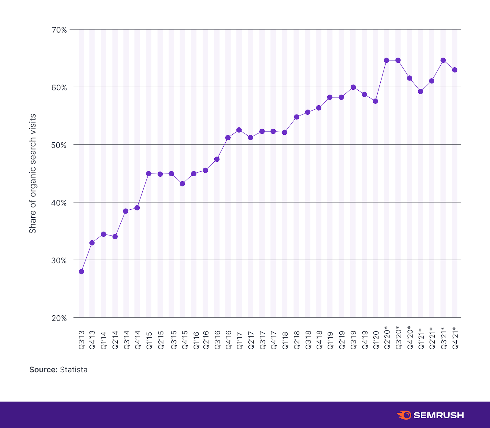
This lines up with mobile becoming the primary source of search engine visits. It’s now estimated to be responsible for over 60% of all searches, as Statista’s data shows:

So, it’s important to apply mobile SEO best practices. There are three ways to design a mobile-friendly site:
- Dynamic serving: This setup serves different versions of the HTML code according to the user’s device. But it uses the same URL across devices.
- Separate URLs: This setup uses different HTML code on separate URLs for different device types. This approach requires more work to ensure search engines don’t see those pages on different URLs as duplicate content.
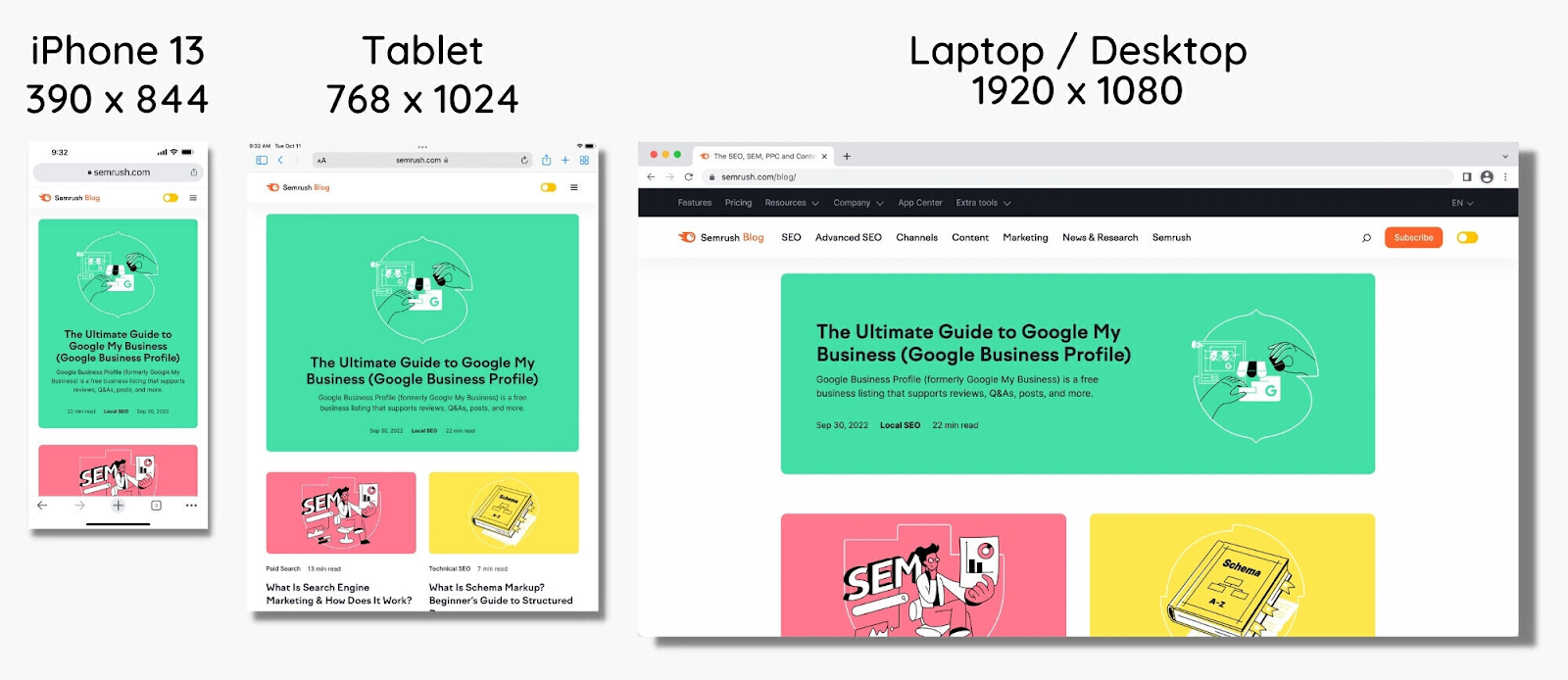
- Responsive design: Responsive design uses the same HTML code and URL for all devices, but the layout can change based on device specifications. This is the method Google recommends.
Here’s what responsive design looks like across different device types:
Content formatting is also important to consider because of mobile devices’ smaller screen sizes.
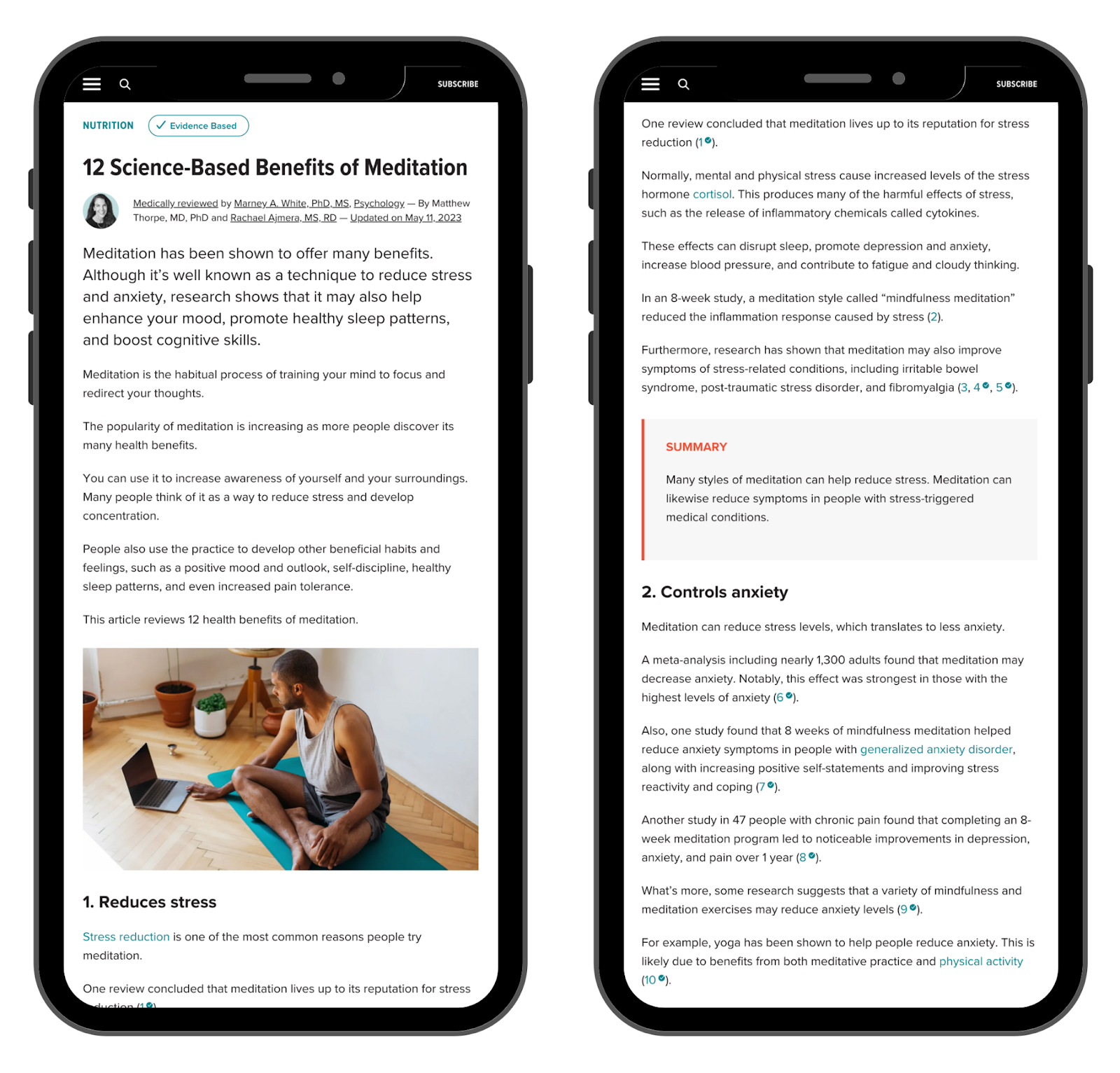
Mobile-friendly content should:
- Include short paragraphs
- Use an appropriate font size (16px is recommended for body copy)
- Incorporate plenty of white space
- Avoid intrusive pop-ups
- Stick to mobile character limits for meta tags (50-60 characters for title tags and under 120 characters for meta descriptions)
Proper content formatting on mobile ensures that pages are legible and easy to navigate, even on the smallest mobile screens.
Here’s an example of a skimmable format on mobile:
Use Google’s proprietary Mobile-Friendly Test to check how well your pages perform from a mobile perspective.
2. Website Speed
Fast page load times prime a website for SEO success.
Page speed is a confirmed Google ranking factor that also influences a page’s bounce rate.
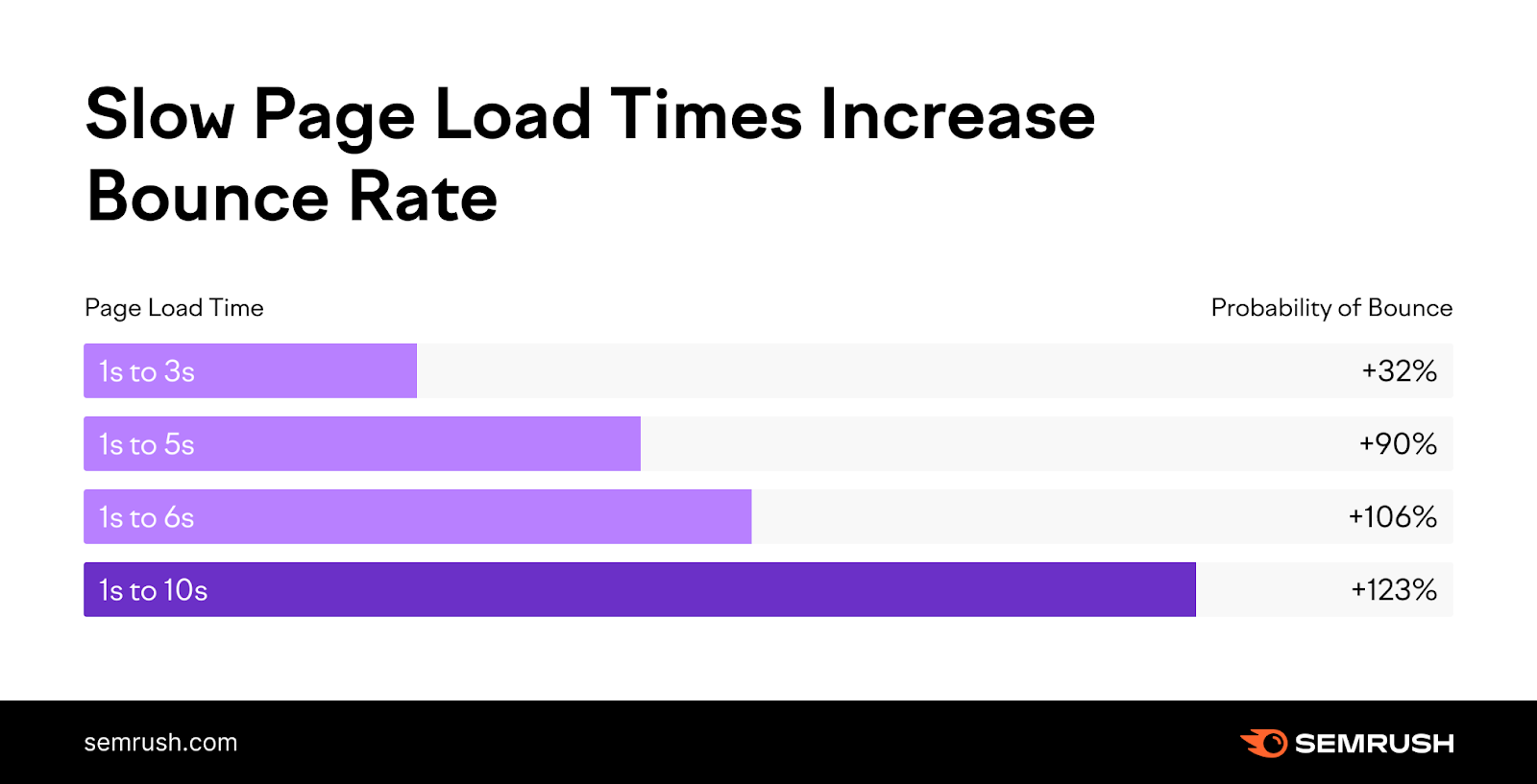
The takeaway?
Shorter load times mean fewer people will bounce from your site without visiting another page.
And web design has an enormous impact on site speed. Because the size of the code dictates how pages load.
There are a range of methods to improve site speed, but the most important include:
- Using the right image format: JPEGs and PNGs are bulkier than you might expect. The WebP format is a modern alternative that can reduce file sizes by up to 34%.
- Reducing HTTP requests: HTTP requests load page content, including images, plugin features, and JavaScript. Reducing the number of requests a browser has to make when loading a page can significantly increase site speed.
- Enabling browser caching: Enabling caching allows users’ browsers to store elements like images and CSS to decrease load times for return visitors.
There are several ways to measure site speed, but Google’s tools are a safe bet.
You can use Google’s PageSpeed Insights tool to get information on the Core Web Vitals (specific metrics that indicate the user experience quality) for any URL.
The tool shares these findings in a report:
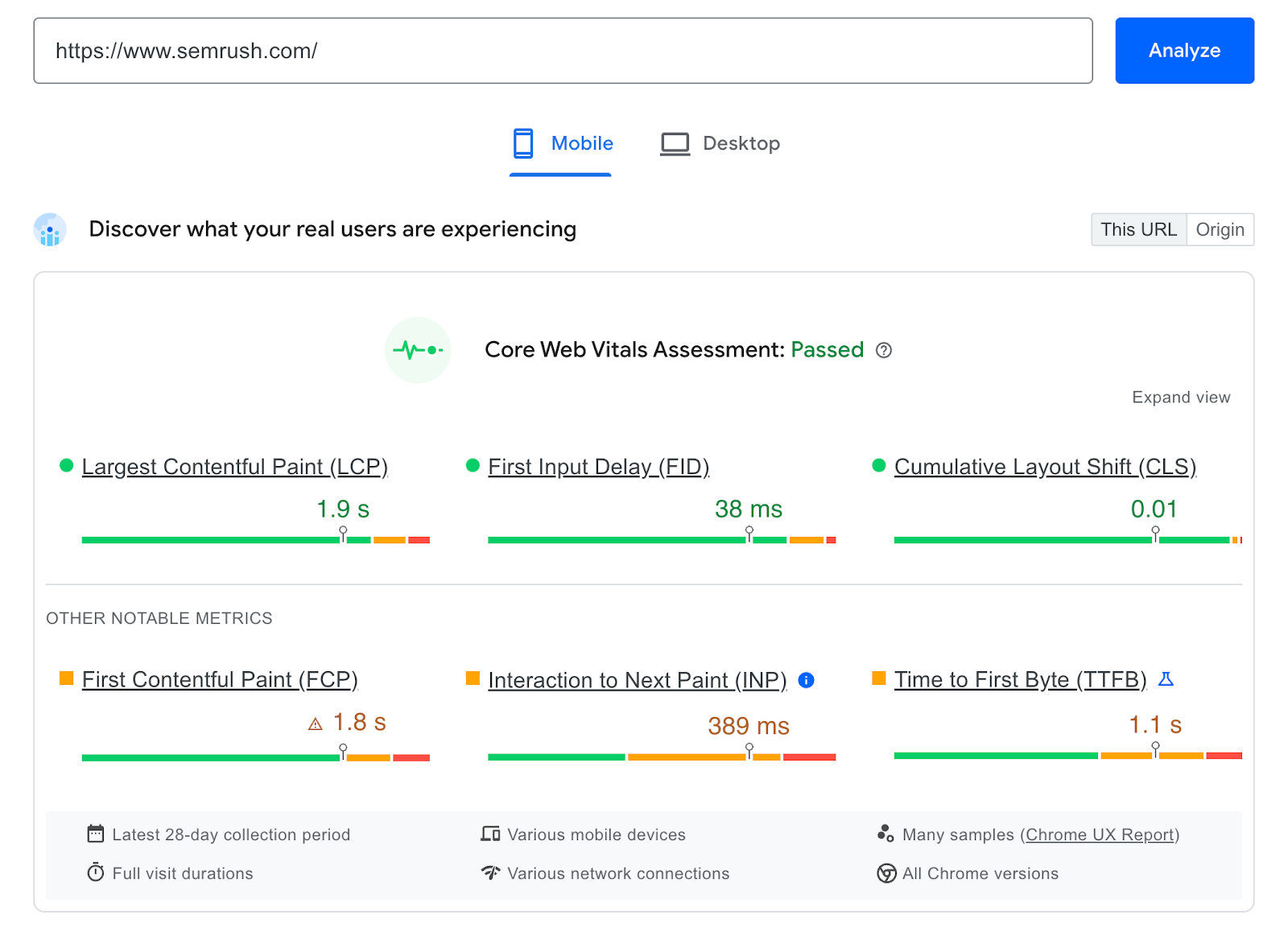
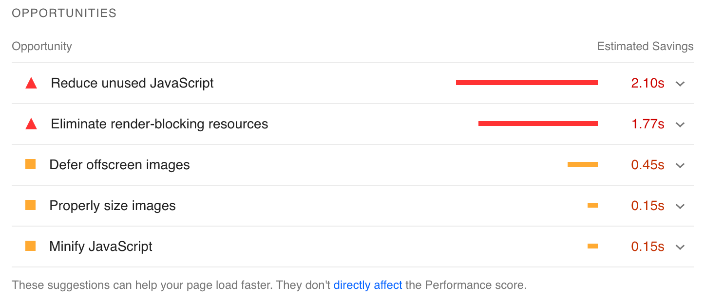
You’ll also get specific insights into how to improve page speed. Plus estimates of how the suggestions will impact load time.
Semrush’s Site Audit tool offers an even more extensive look at site performance metrics.
Go to the Site Audit tool, enter your website URL, and click “Start Audit.”
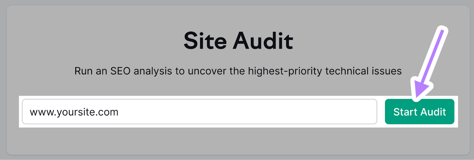
You’ll then see “Site Audit Settings” in the window that appears.
Next, select how many pages you want crawled and choose the crawl source. And click “Start Site Audit.”

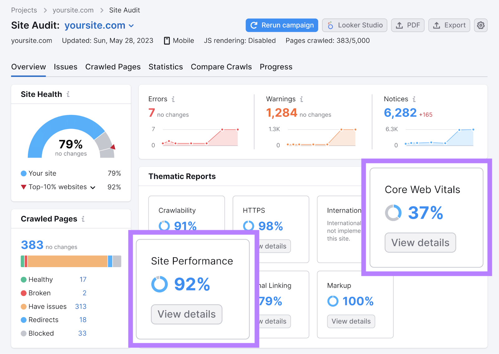
When the audit is done, you’ll get an overview of your website’s performance. And recommendations on how to fix issues related to site speed when you click “Site Performance” or “Core Web Vitals.”
3. Website Structure
An intuitive website structure (also called website architecture) gives visitors the best navigation experience. And helps search engines find and better understand your pages.
Best practices for SEO-friendly web design involve creating content buckets that groups pages together. So more specific categories are nested under more general categories.
Like this:
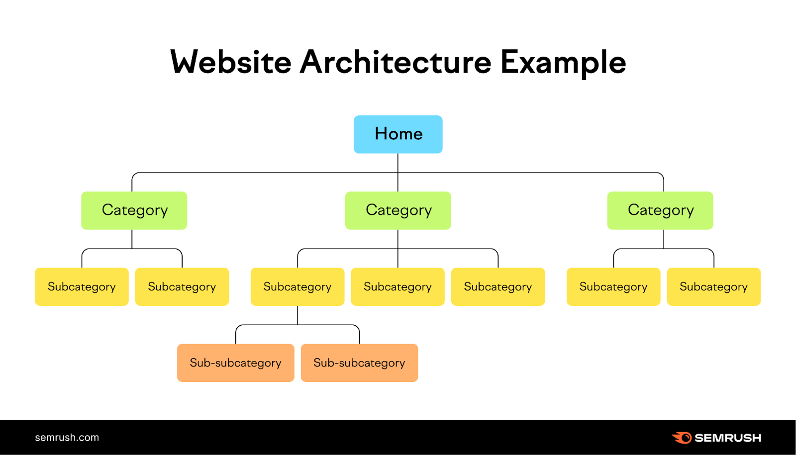
In practice, this lets you create a URL structure that’s intuitive to navigate.
For example, on a website filled with content about different dog breeds, a section of the URL structure might look like this:
- dogbreeds.com
- dogbreeds.com/terrier
- dogbreeds.com/terrier/yorkshire-terrier
- dogbreeds.com/terrier/yorkshire-terrier/temperament
- dogbreeds.com/terrier/yorkshire-terrier/care-guide
- dogbreeds.com/terrier/yorkshire-terrier/size
- dogbreeds.com/terrier/scottish-terrier/
- dogbreeds.com/terrier/scottish-terrier/temperament
- dogbreeds.com/terrier/scottish-terrier/care-guide
- dogbreeds.com/terrier/scottish-terrier/size
- dogbreeds.com/terrier/bull-terrier/
- dogbreeds.com/terrier/bull-terrier/temperament
- dogbreeds.com/terrier/bull-terrier/care-guide
- dogbreeds.com/terrier/bull-terrier/size
- dogbreeds.com/terrier/yorkshire-terrier
- dogbreeds.com/terrier
Each step down in the site structure dives into a more detailed subcategory of the topic you started with.
This type of intuitive web design will:
- Make it easier for search engines to find and index your content
- Help users understand the relationship between pages
- Spread authority across the website through contextually relevant internal links
4. Navigation and Internal Links
Just like the website structure, internal linking helps search engines understand your site structure and aids in user navigation.
There are two types of internal links to consider: navigational and contextual.
Navigational links are present site-wide and include links that are in the website header, footer, and navigation bar.
Contextual links are found in the main body content of a page to direct users to related content. And they’re usually placed using relevant anchor text that helps users understand what they’re about to click on.
Like this:

There are a few important considerations to keep in mind regarding internal links when designing a website:
- Make sure all pages have at least one incoming internal link to avoiding orphan pages (pages that neither crawlers nor users can easily reach)
- Use anchor text that effectively communicates what the content on the destination page is about
- Use breadcrumb links (a trail of easy-to-navigate links) to help users find their way through the site
- Create topic clusters by interlinking pages that contain related content
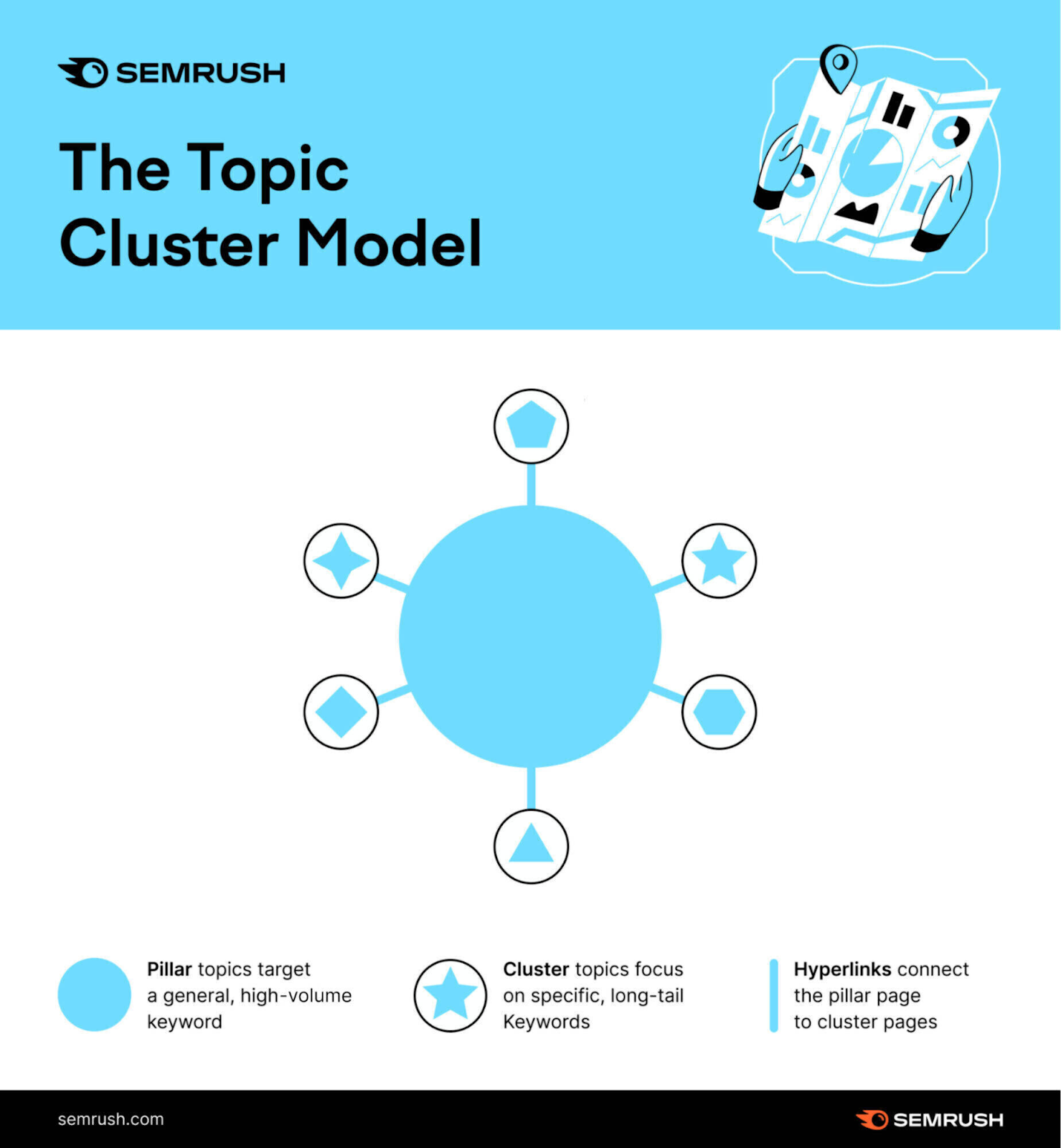
Topic clusters can be especially helpful. They’re groups of content that center around a main topic. Using them on your website gives users plenty of related content to explore, keeping them on your site for longer.
The below image illustrates topic clustering using a central pillar page that covers the main topic. And other pieces that are related (and linked) to it:
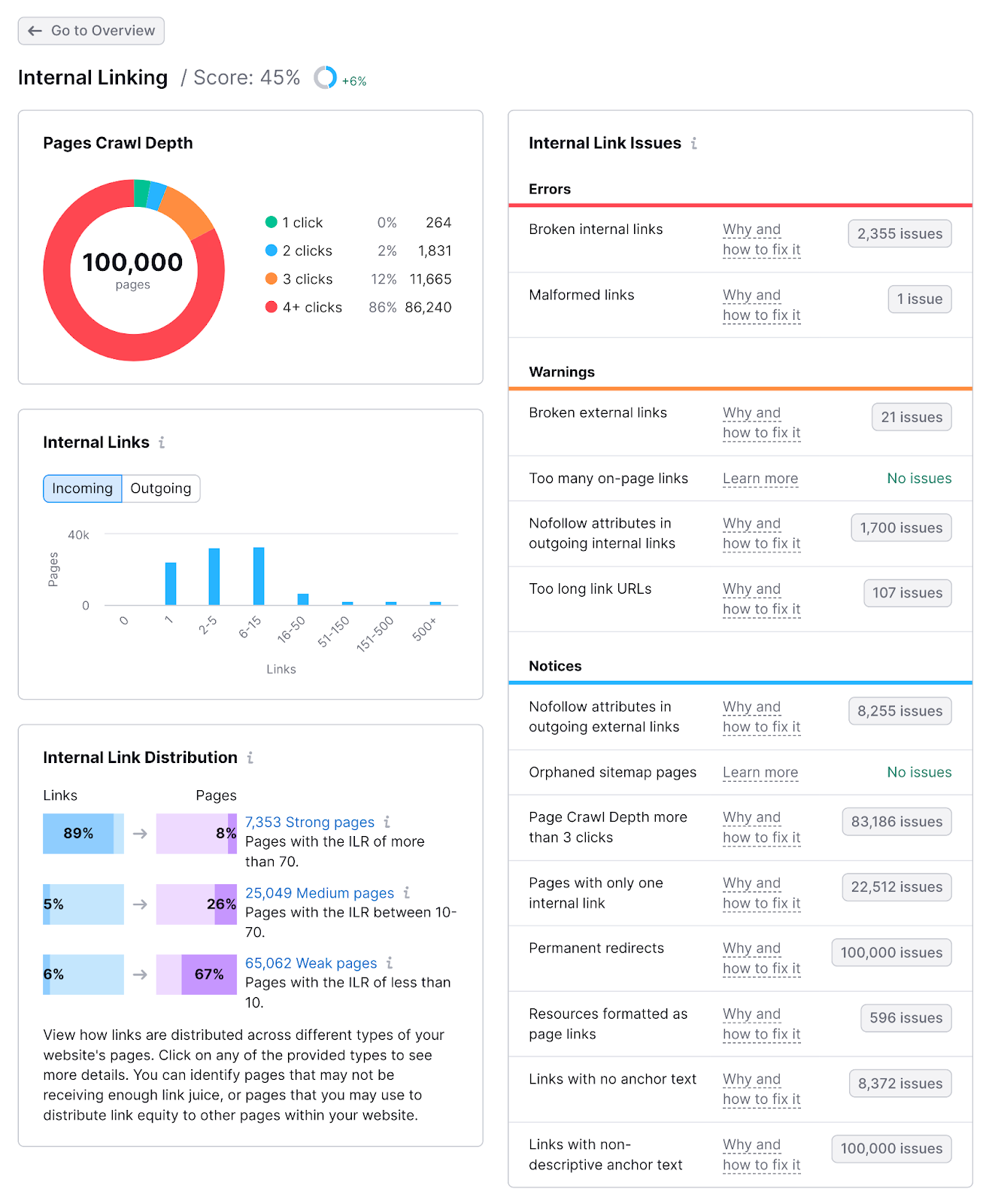
You can use Semrush’s Site Audit feature or a similar tool to get an overview of your internal linking performance.
Run an audit using the same method outlined in the section about website speed.
Then, click “View Details” on the “Internal Linking” report to get information on:
- The crawl depth (how many links deep a page is from the homepage) of every page on-site
- Which pages have the least or most internal links pointing toward them
- Broken internal links, and how to fix them
5. Indexability and Crawlability
An SEO-friendly website has to be designed in a way that makes it easy for Google to find and understand it. This is what indexability and crawlability are all about.
Crawlability refers to how well a web crawler can access pages across a website. And Google will only crawl so many pages before it reaches its limit for your site.
Poor internal linking and redirect loops can stop crawlers from accessing all your content.
Indexability refers to Google’s ability to understand and index content.
Duplicate content without a specified canonical (or “main”) page designated can cause indexability issues, for instance.
Crawlability and indexability work together to serve search results intended to be the most useful for users.
The most important things to do to improve a website’s crawlability and indexability are:
- Leverage internal linking: You need to make sure crawlers can navigate your website through internal links. Ensure that every page has at least one incoming link from another page on-site.
- Use noindex tags properly: You can direct Google to avoid indexing certain pages using robots meta tags. Using these tags keeps search engines from indexing content that’s not designed for end users.
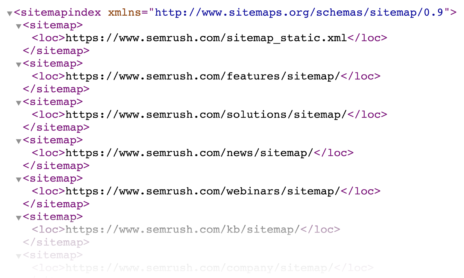
- Submit a sitemap: A sitemap is a small file that lists every important page on a website. Creating one and submitting it through Google Search Console ensures crawlers can reach the pages on your site.
The image below illustrates what an XML sitemap looks like. It shows how the website is split into categories.
6. Page Design and Usability
SEO-friendly page design ensures both search engines and visitors have a good experience.
Here are some basic rules to make sure your pages deliver a positive experience:
- Build for page experience signals: Google’s page experience signals measure how well a page matches users’ expectations. Key signals include things like Core Web Vitals, mobile-friendliness, and HTTPS encryption.
- Use proper headings: HTML heading tags (H1, H2, etc.) help crawlers understand the hierarchy of information on a page. A properly nested heading structure makes your content easier to understand.
- Minimize off-page content elements: JavaScript and iframes are both used to pull content from elsewhere onto a page. They can be useful to make sites richer, but they also slow page load times and diminish the experience if they don’t load properly.
The following video discusses Google’s expectations when it comes to page experience signals:
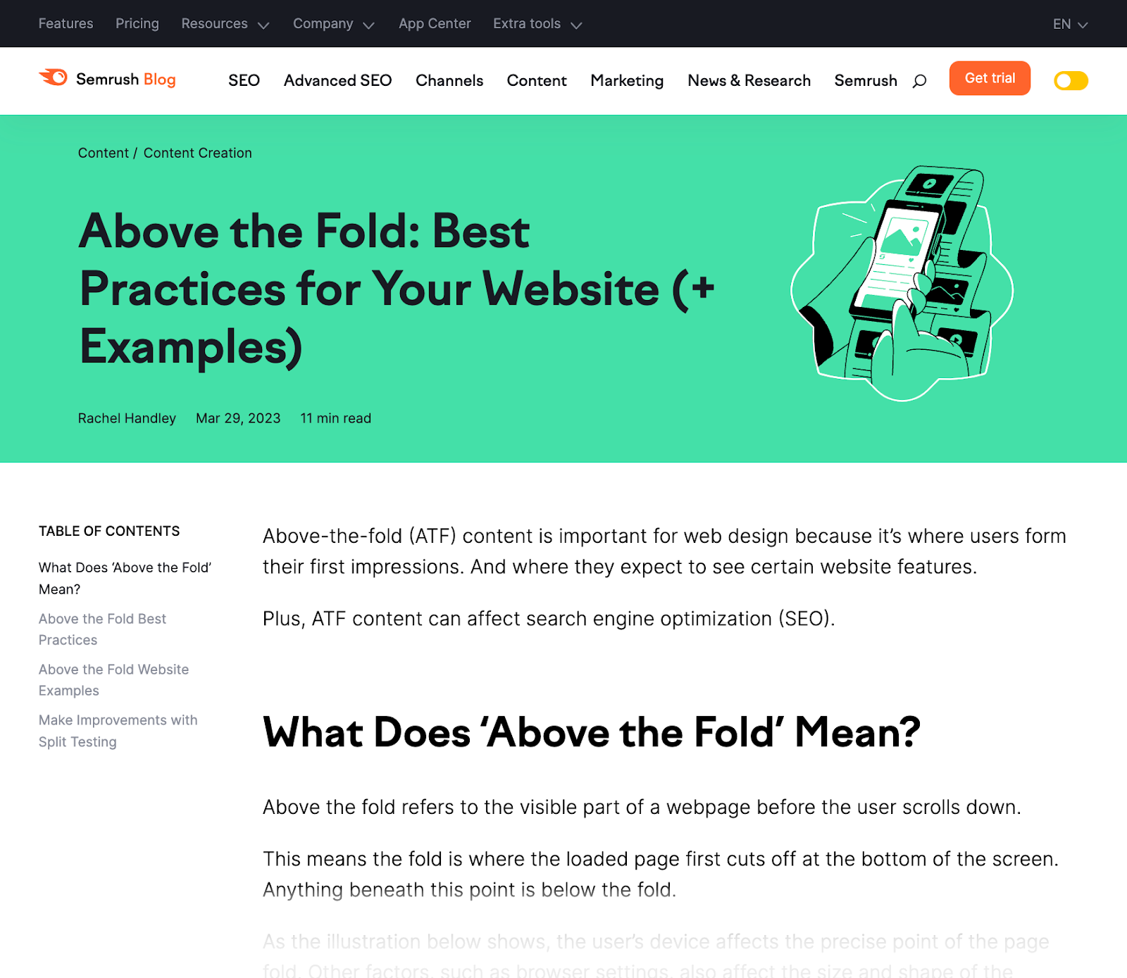
Prioritizing above-the-fold content is also important for good website design. Because it offers users value as quickly as possible.
This typically involves making sure there’s relevant, valuable information displayed immediately. Users shouldn’t have to scroll to see what’s most important.
Good above-the-fold content makes it clear what the page is about, offers users navigation options, and has few distractions that could take them away from the page.
Like this:
7. Accessibility
Search engines don’t consider accessibility a direct ranking factor that they bake into their search ranking algorithms.
Why?
Because it’s hard to tie it to concrete metrics.
But accessibility does affect a known ranking factor: user experience.
So, it’s important to consider accessibility when creating an SEO-friendly website.
Google has its own accessibility guidelines, which include:
- Leveraging image alternative text: Alternative text (known as an alt tag) describes the image so that screen readers can read it aloud to visually impaired users.
- Using high-contrast colors: High color contrast in website design makes it easier to distinguish between text, background, and images. Subtle color combinations, like gray text on a white background, make your page harder to read.
- Ensuring font legibility: Your choice of font size and text alignment affect how legible content is on your site. Use a minimum of 16px font size and left alignment to ensure your page is easy to read.
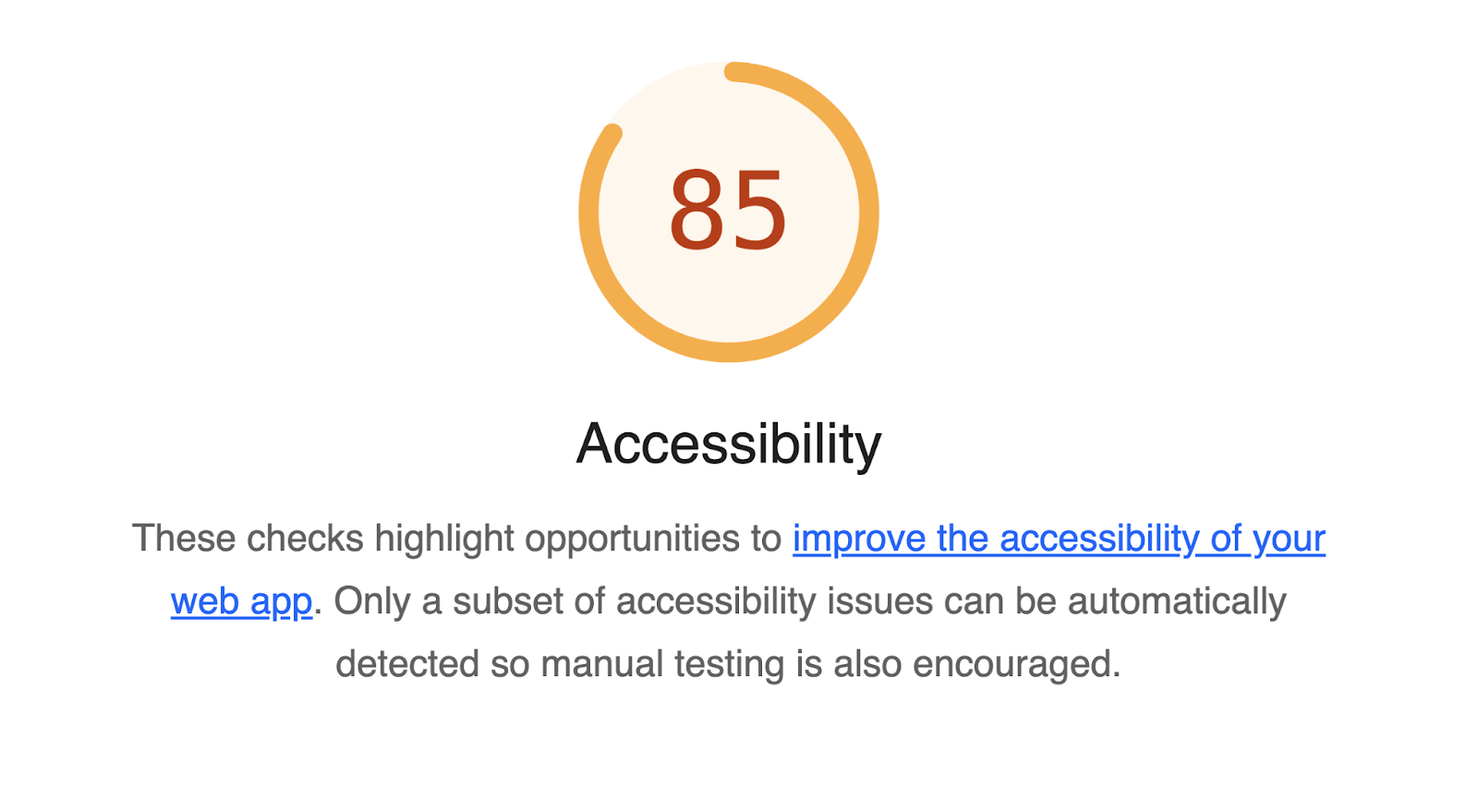
You can run basic accessibility tests on your website using the Google Lighthouse browser extension. It’ll tell you where your site falls short, guiding you on achieving maximum accessibility.
8. Schema Markup
Schema markup is a structured data language that describes elements on your website in a way that search engines understand.
Search engines can use schema to pull useful information from webpages directly onto search engine results pages (SERPs). And give searchers better results.
Implementing schema also offers the opportunity to gain rich results—search results that include added visual or interactive elements.
Google is able to use that structured data to display things like FAQs, how-to sections, and reviews.
For example, the image below shows a search result with the corresponding reviews:

Implementing schema on your website is relatively simple, especially when handled as part of the design process.
Use Google’s Structured Data Markup Helper to generate schema.
After you select your data type and enter your URL, the tool will load your page and allow you to mark it up.
It looks like this:
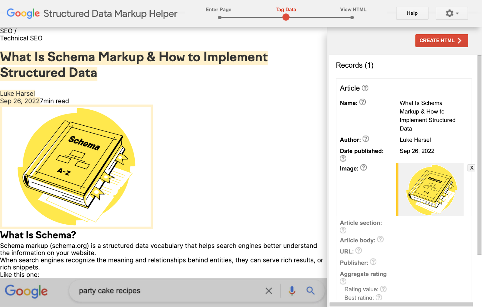
Once you’re done, click “CREATE HTML” to receive the code you’ll add to your website.
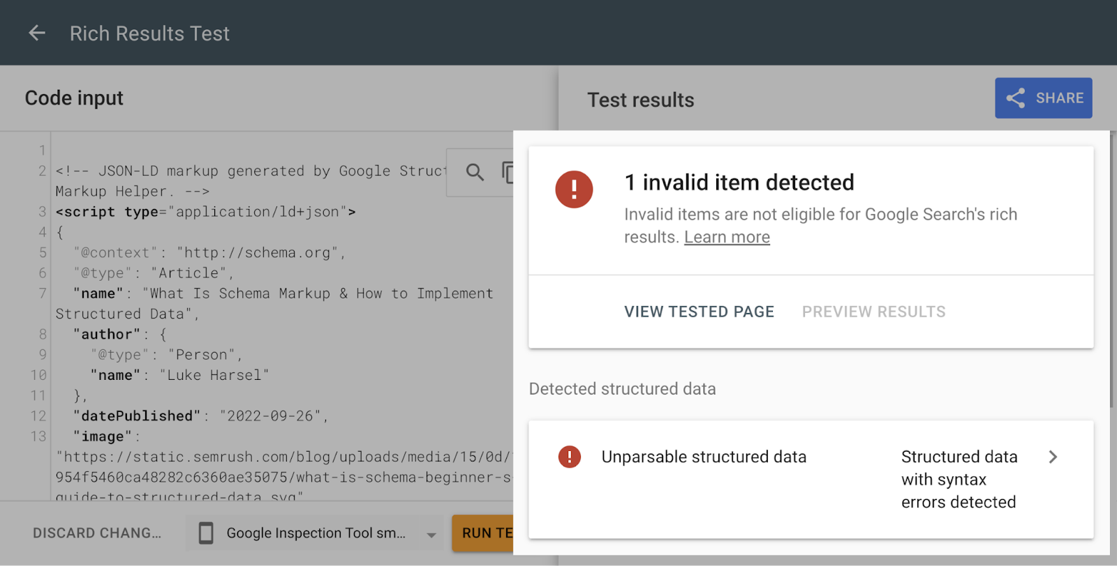
And you can use the Rich Results Test tool to make sure your Schema is applied properly and can feed into rich results on live SERPs.
Enter the URL or code to see whether there are any errors you need to fix.
9. Images
Optimizing images for SEO during the website design stage means you can gain additional traffic from image searches.
Image SEO revolves around some basic principles, which Google covers in its guide to image optimization.
In the video below, Google’s John Mueller covers the full benefits of optimizing images:

To make the most of image search opportunities, make sure that every image on your website has:
- A descriptive file name: Replace generic, non-descriptive file names (like image123.jpg) with a concise description of the image (like black-ford-bronco.jpg)
- An appropriate file format: Use the right format for images depending on their size and quality, such as PNG, JPEG, and WebP
- Optimized image alt text: Use the alt text attribute to optimize for search and make the image accessible for people using screen readers by providing a short description of the image
How SEO-Friendly Web Design Can Help Your Business
Designing a website with SEO principles as guidelines impacts the user experience and benefits your business’s performance.
The core benefits include:
Boosting Your Visibility
Starting your web design with SEO in mind ensures the website you’re building has a better chance of capturing organic (unpaid) traffic.
All the tips above maximize your chances of ranking for your target keywords.
Focusing on creating quality content and developing a healthy backlink profile will also improve your chances of getting more organic traffic.
Future-Proofing Your Site
Considering SEO as a core part of the website design process means you’ll have a strong foundation for optimization.
There are many changes to the search algorithm every year, ranging from minor tweaks to significant overhauls.
Starting with SEO in mind will make it easier to keep up with future updates.
Making a Good Impression
A website optimized for search is also optimized for users. And leaves them with a positive impression.
In fact, 50% of people believe website design is crucial to overall brand perception.
So, taking the time to build a website based on SEO principles can be good for your brand reputation. And increase the chances that users will return.
SEO + Web Design Can Boost Your Website’s Potential
Designing and building your website according to SEO best practices ensures you’ve equipped your website for high performance.
Ready to get started?
Make sure you have the right tools for the job. You can try Semrush for free.

